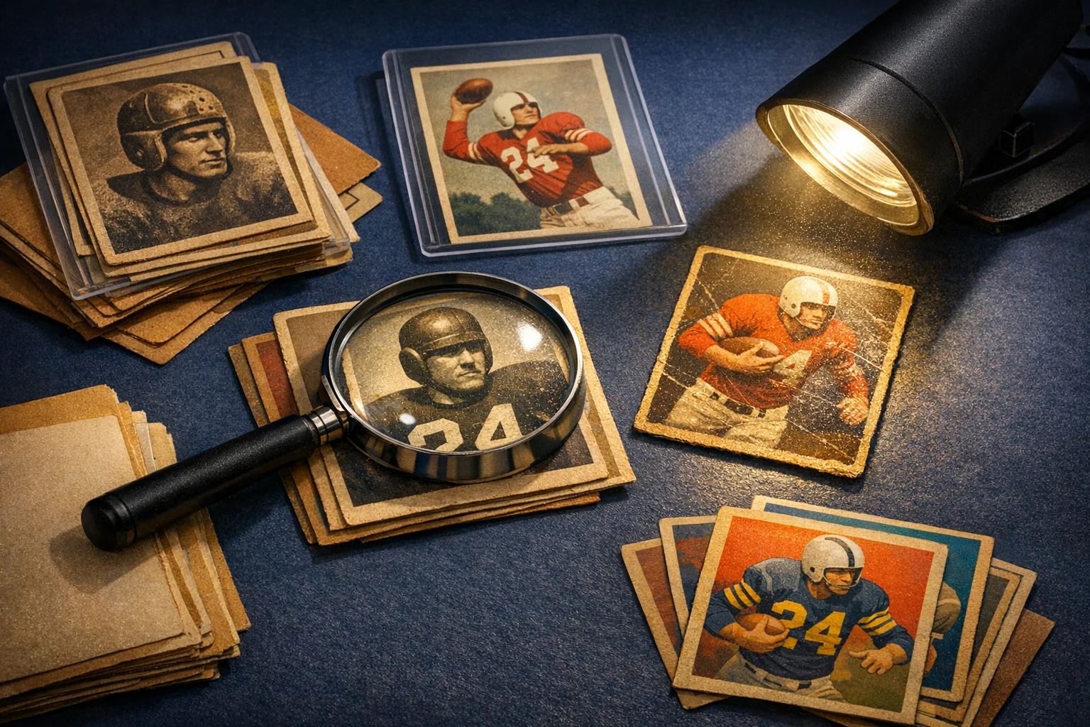
The cleanest-looking card photo is not always the most truthful one. In sports cards, a beautiful image can hide the exact flaws that matter most: soft corners, edge chipping, scratches, wrinkles, gloss breaks, stains, print lines, and signs of possible alteration.
If you want buyers to trust your listings or fellow collectors to trust your trade photos, the goal is not to make a card look dramatic. The goal is to make it legible. That means accurate color, controlled glare, visible corners, readable edges, and at least one angle that helps the surface speak for itself.
A useful mindset is to photograph the card the way a careful buyer would inspect it in hand. Show the front. Show the back. Show the corners. Show the surface under reflected light. Then show any meaningful defect closely enough that nobody has to guess what you meant. The result is not just better-looking listing photos. It is better condition communication.
Photograph for the same condition questions buyers already care about
Collectors usually do not need photos for art alone. They need photos that answer condition questions. Across the hobby, the same basic categories come up again and again: corners, edges, surface, and overall presentation. If your images leave any of those categories vague, buyers start filling in the blanks themselves, usually in the least generous direction.
That changes how you plan a photo set. A straight-on front image can show centering, eye appeal, and basic color. A straight-on back image can reveal stains, paper loss, print issues, and back-edge wear. But neither one does a complete job on its own, especially when the most important defect is a shallow wrinkle, a chrome scratch, or a dark-border chip that appears only when the light hits correctly.
Think less about the single best-looking frame and more about coverage. If a card’s value could swing because of one touched corner or one faint surface line, build your photos around that risk. A buyer should not have to assume the corners are fine because you did not show them closely, or assume the surface is clean because the glare happened to skip past the scratches.
This approach helps you as much as it helps the buyer. Clear documentation reduces the number of messages asking for extra angles, lowers the chance of avoidable disputes, and makes your asking price easier to defend. Even when a card has flaws, good disclosure can make the listing stronger because uncertainty often scares collectors more than wear itself.
- Ask of each image: what condition question does this answer?
- Use separate images for overview, back condition, corners, and surface behavior in light.
- Adjust your emphasis for glossy modern cards versus matte vintage cards, but keep the same core condition categories in mind.
Use lighting that reveals the card instead of flattering it
Most misleading card photos are not edited into dishonesty. They start with bad light. Direct flash, a harsh ceiling bulb, or a bright desk lamp aimed straight down can create blown-out hotspots, kill true color, and flatten detail that should be visible. A more reliable setup uses even, diffused light first, then adds an extra angle only when you need to reveal the surface.
For many collectors, simple works well. Place the card on a neutral background, use soft light from the side or near a window with indirect daylight, and keep the camera square to the card for your overview shots. That arrangement usually produces more usable images than an expensive setup used carelessly. The point is not to create sparkle. It is to let the buyer see the stock, ink, borders, and wear without fighting glare.
Background choice matters more than it seems. A black-bordered card on a black mat can make edge chipping disappear. A white-bordered vintage card on a bright white desk can make touched corners blend into the background. Medium gray is often a safe compromise because it keeps attention on the card while still separating the edges. If gray is not available, choose any plain background that contrasts enough to show the borders honestly.
Imagine you are listing a glossy modern rookie parallel with dark edges. Under direct flash, the center may shine while the border wear vanishes. Under softer light on a contrasting background, the same card may look slightly less dramatic but much more trustworthy. That trade is worth making. Buyers are not paying for your lighting style. They are paying for confidence in what they are seeing.
- Avoid direct flash when possible.
- Avoid a single harsh overhead light.
- Start with soft, even light before experimenting with angle shots.
- Use a plain background with enough contrast to separate the card from its edges.
- Prioritize accurate color over dramatic shine.
Begin with straight-on front and back photos, then treat them as the baseline
A good rule of thumb for most sales or trade discussions is to start with a straight-on front image and a straight-on back image. Not because that is a formal universal rule, but because it gives collectors the two overview views they most expect. Those images identify the card, show broad eye appeal, and establish where later close-ups fit.
The front overview helps a buyer judge presentation at a glance: centering, print alignment, border strength, major stains, and obvious edge or corner wear. The back overview adds information that often changes a card’s appeal more than sellers expect. A clean front paired with wax staining, paper loss, writing, or heavy back wear is still a very different card than the front alone suggests.
But these baseline shots should be thought of as the start, not the full story. Straight-on photos are often weak at showing angle-dependent defects. A shallow indentation can disappear. A scratch can blend into gloss. A small wrinkle may flatten visually until the light rakes across it. If you stop at the two nicest overview shots, your images may be attractive while still leaving out the most important condition evidence.
Suppose you are selling a chrome card that looks sharp face-on but has a few lines visible only when tilted. If you post only the square front and back, some buyers will assume the surface is cleaner than it is. If you add one honest angled image, the listing becomes much clearer. The card may not seem quite as pristine, but it becomes easier for the right buyer to decide with realistic expectations.
- For most listings, start with one square front image and one square back image.
- Fill enough of the frame to show detail without clipping corners or edges.
- Use the overview images to orient buyers before you show close-ups or flaw shots.
Show the card twice: once for true color, once for reflected-light truth
One of the most useful habits in honest card photography is taking two intentionally different kinds of photos. The first is the true-color view: straight, evenly lit, and glare-controlled. The second is the reflected-light view: angled enough that the surface reveals scratches, scuffs, gloss loss, print lines, wrinkles, or indentations. Each image tells a different truth, and neither fully replaces the other.
This matters because many important defects are angle-dependent. A buyer looking at a flat image may see strong color and clean design but miss the surface story entirely. If the flaw appears only when the card catches light, the listing should usually include an image that catches that light on purpose. Otherwise the condition is technically present but visually hidden.
There is a real balance to manage here. Tilt too little and the scratch disappears. Tilt too much and the card becomes unreadable, color shifts, and centering becomes harder to judge. The goal is not a dramatic glamour shot where half the card turns into white flare. The goal is a controlled angle that reveals the surface without sacrificing all context.
This is especially important for chromium, refractor, holofoil, acetate-style, and other glossy products, but vintage cards benefit too. A faint wrinkle on older stock may be hard to spot face-on and obvious the moment light skims across it. If you are photographing a 1970s star with a clean-looking front and one subtle wrinkle near the border, a reflected-light shot can tell that story far more honestly than a written note alone.
If you only have time for one extra image beyond front and back, make it the surface-reveal angle. In many cases that single addition does more to reduce misunderstanding than several nearly identical beauty shots.
- Pair a true-color image with a surface-reveal image.
- Tilt only enough to expose the flaw pattern, not so much that the card becomes unreadable.
- For glossy cards, take a few slight angle variations and keep the clearest one.
- Use reflected light to show surface condition, not to create drama.
Give corners and edges their own close-ups when they matter
Corners decide a surprising number of buying decisions. On higher-grade cards, a single soft tip can change the whole conversation. On vintage cards, mild rounding may be completely acceptable to one buyer and a deal-breaker to another. That is why a full-card image that technically includes all four corners is not always enough. Buyers often need to see those corners closely enough to evaluate them, not just confirm that they exist.
Dedicated corner photos are especially useful on dark modern issues where tiny whitening is easy to miss, and on vintage cards where rounding, fraying, or small bends blend into the overall image. If one corner is clearly weaker than the others, showing it directly is usually better than leaving buyers to discover it after the sale. Transparency can actually protect the card’s stronger qualities because it keeps collectors from assuming all four corners are equally bad.
Edges deserve the same treatment. Small chips along black borders, rough cuts on older cards, foil nicks, or slight layering issues can vanish when the card is photographed against a low-contrast background. A closer crop of the long edges can answer questions the overview shot leaves unresolved. That is especially helpful when a card otherwise presents well and the main risk is hidden along one side.
Picture a hypothetical buyer choosing between two similar copies of the same card. Listing A has one front photo and one back photo. Listing B has those plus close-ups of the corners and a clear shot of the right edge where there is mild chipping. Even if Listing B shows more flaws, many collectors will trust it more because the seller is reducing guesswork rather than inviting it.
- Use dedicated corner shots for higher-value or condition-sensitive cards.
- Make sure the resolution is high enough to show tip wear, whitening, or fuzzing.
- If one corner is weaker, show it clearly instead of hoping it gets overlooked.
- Choose a background that contrasts with the card edge.
Surface flaws need angle-aware photos and context shots
Surface is often the easiest part of condition to under-photograph. It includes scratches, scuffs, stains, gloss breaks, print lines, wrinkles, indentations, smudges, and other marks that may appear or disappear depending on the angle. Because many of those flaws are subtle, a full-card image alone can leave too much room for interpretation.
A useful pattern is to show the flaw twice when possible: first in context, then in close-up. The context shot tells the buyer where the issue sits on the card. The close-up tells them what the issue actually looks like. Without context, a macro image can seem more severe than it is. Without the close-up, the overview can make the flaw sound abstract or insignificant.
For glossy modern cards, the challenge is to manage reflection rather than eliminate it. Total glare hides the card. Total glare avoidance can hide the scratch. The sweet spot is a controlled reflection crossing the affected area. For vintage cards, the challenge may be shallower but still important. Wrinkles, light creases, wax residue, and disruptions in gloss or paper texture often become visible only when light skims across the stock.
Suppose you are selling a card with a small surface indentation near the logo. If you mention it only in words, one buyer imagines a tiny pin mark while another imagines a crater. A close-up taken at the right angle narrows that gap. It may not settle every opinion, but it replaces vague language with visible evidence.
The practical lesson is simple: when the condition issue is small, do not make the buyer rely on your adjective. Show what you mean.
- Take at least one angled image specifically for the surface.
- Show notable flaws in context first, then tighter if needed.
- Use controlled reflection to reveal scratches, wrinkles, or indentations.
- Do not mistake normal shine for proof of a clean surface.
Clear photos also help with alteration concerns
Condition photography is not only about ordinary wear. Some lighting choices can also obscure signs that make collectors worry about alteration, especially on expensive or condition-sensitive cards. Corners that look unusually rebuilt, edges that seem unnaturally sharp compared with the rest of the card, or dark borders with suspiciously uniform color deserve clean, readable photos rather than moody shadows.
That does not mean you need to turn every listing into a forensic exam. It means you should avoid image choices that conveniently blur the places a careful buyer would want to inspect. If a card’s design naturally hides wear, compensate by improving contrast and showing the edge line more clearly. If a border color makes recoloring concerns more likely, choose lighting that shows whether the color sits naturally in the stock and print or appears oddly on top of it.
For a hypothetical example, imagine a vintage star with one corner that looks much darker than the others in a soft, shadowy photo. A collector may wonder whether that is lighting, print, or recoloring. A brighter close-up from a second angle can help separate those possibilities. You are not expected to resolve every authenticity question through photos alone, but you should not make evaluation harder than it needs to be.
Collectors often read evasive images as a warning sign. Even if the card is fine, unclear photography around vulnerable areas can create doubt that costs you trust. Clearer images may not answer every advanced question, but they show that you are not hiding from them.
- Use clear edge and corner close-ups on cards where alteration concerns could matter.
- Avoid heavy shadow or low-contrast lighting on dark borders.
- If the design masks wear, offset that with better contrast and closer detail.
Build a repeatable shot list and edit conservatively
Most photography problems come from inconsistency. One card gets careful coverage. The next gets two rushed photos. Buyers cannot tell whether the missing angles mean the card is clean or the seller was hurried. A repeatable shot list helps solve that. It also saves time because you stop reinventing the process with every listing.
For many cards, a sensible routine is an overview front, overview back, one surface-reveal angle, and any flaw-specific close-up that the card clearly needs. On higher-value or condition-sensitive cards, add dedicated corner or edge shots. That is not a rigid law for every listing. A low-value binder copy may not need the same treatment as a premium rookie parallel or a vintage key card. The point is to make sure your normal process covers the condition categories that matter most.
Editing deserves the same restraint. Cropping, straightening, and mild exposure correction can make images more usable. Problems begin when editing changes how wear, gloss, or color reads on screen. Heavy sharpening can make edges look different from reality. Aggressive smoothing can mute scratches. Saturation changes can alter stains, paper tone, or border wear.
A helpful internal test is this: does the image look like the card under good light, or does it look better than the card does in hand? If it looks better, stop. Honest photography is not anti-polish. It is anti-distortion. Clean presentation is good. Clean presentation that changes the perceived condition is not.
Before you post, enlarge the images and inspect them the way a cautious buyer would. On a phone thumbnail, almost any card can look cleaner than it is. At full size, you can see whether your photos are actually answering the buyer’s likely next question.
- Use a repeatable baseline: front, back, surface angle, and flaw-specific close-ups as needed.
- Add corner and edge close-ups when value or condition sensitivity justifies them.
- Crop and straighten, but keep color and texture realistic.
- Review photos full-size before posting, not only as thumbnails.
The best card photos reduce uncertainty
Collectors sometimes assume better photos are the ones that make a card look most impressive. In practice, better photos are the ones that make the card easier to judge. A trustworthy image set lowers uncertainty. That can matter just as much as raw eye appeal, especially when a buyer is comparing similar cards and trying to decide which listing feels safest.
You can still make your photos attractive. Clean composition, balanced light, and a tidy background all help. The difference is that the appeal should come from clarity rather than concealment. A sharp overview, a readable back, visible corners, and one truthful surface angle can still look polished. They simply do the job buyers actually need them to do.
A good standard to remember is this: photograph the card so a careful buyer might disagree with your grade opinion, but not with what you showed them. That is realistic. Honest photos do not guarantee a sale, a grade, or a complaint-free transaction. They do something more useful. They replace ambiguity with evidence.
When your routine is built around true color, controlled glare, visible corners, readable edges, and angle-based surface truth, you are no longer just taking nicer card pictures. You are documenting condition in a way that respects how collectors really buy.
- Clarity builds trust better than dramatic lighting.
- A complete image set lowers the need for guesswork.
- Your strongest photos are the ones that answer the buyer’s next question before they ask it.
Illustration generated for this guide; not a photograph of an actual card, product or event.
Photo Gallery